General Information
- Respond to a bar chart, pie chart, line graph, table, map or flowchart
- Write at least 150 words
- Select and report on the main features
- For charts/graphs/tables, describe the data and compare it, reporting any significant results or trends that you notice
- For flowcharts, describe the process of how the thing works/is done
- Spend no more than 20 minutes on this task
Structure of the Essay
Paragraph 1: Opening (approximately 40-60 words)
Describe what the graph/chart/flowchart is showing or describing without copying the wording in the question.
Paragraph 2: Main Body (approximately 100-130 words)
Highlight the key information. Support points with examples or numbers from the data. There is no need to speculate or provide your own opinion on the data.
Paragraph 3: Conclusion (approximately 30-50 words)
Summarise the most important points from the data.
Sample Question: Maps
The map below shows the changes that have taken place in the town centre of Arlingdale since 1990.
Summarise the information by deciding on and exploring its main features, and make any relevant comparison.

Model Answer: Maps
These three maps show developments in the town of Arlingdale between 1990 and 2010. There are three stages of development; 1990, 2000, and 2010.
In 1990, a bakery and pharmacy were located next to the main road. A large area behind the bakery was used for a supermarket. The area adjoining the supermarket was used for a car park.
By 2000, the bakery and the pharmacy had been demolished to make way for a large hospital to be built. Furthermore, space once utilised by the supermarket was converted into a school.
In 2010, the central town area remained largely unchanged. However, the school area was extended to cover a part of the land previously occupied by the hospital.
As a result of this, the hospital building was reduced in size. The car park space has maintained its size and stayed in its same location throughout the twenty-year period.
Over time, the main changes to the town of Arlington have been the addition of the hospital and school. The size of certain amenities has been altered over time to meet residents’ changing needs.
Key Words and Phrases
- between … and …
- In …
- By …
- Furthermore, …
- However, …
- As a result of this, …
- Over the course of this period, …
- Due to …
- One key feature…
- The … signifies …
- The … symbolises …
- In contrast, …
- Overall, it appears that…
Practice Test: Maps
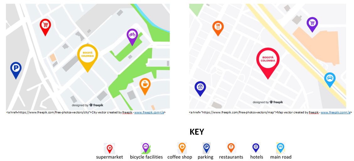
These maps show different areas of the city of Bogotá, Colombia.
Summarise the information by deciding on and exploring its main features, and make any relevant comparison.

Practice Test: Sample Answer
These two maps show the amenities available in two districts of Bogotá, Colombia; the yellow district and the red district.
One key feature of the red district is the main road running through it. The car symbol on the map signifies an area in which there is a high volume of cars and other traffic.
Due to this, the red district also has a hotel available for motorists passing through the area. In contrast, the yellow district has only smaller roads.
For residents living in the yellow district, the supermarket is more accessible. Parking is located nearby, and there is no need to cross any main roads to enter.
In contrast, in the red district, residents need to pass to the other side of the main road to access the supermarket.
People residing in the red district appear to have access to restaurants, while yellow district residents only have coffee shops available in the immediate area. However, the yellow district, located away from any main roads, also provides bicycle facilities.
Overall, it appears that the yellow district offers a more ‘local’ living experience, with coffee shops and supermarkets located within walking distance and bicycles on offer to locals to get around.
In contrast, the busier red district has been developed for both locals and passing motorists alike.

